Logos are just the cherry on top. Good branding requires developing real characteristics.
Branding is all in the Process.
How do we go
from zero to hero?
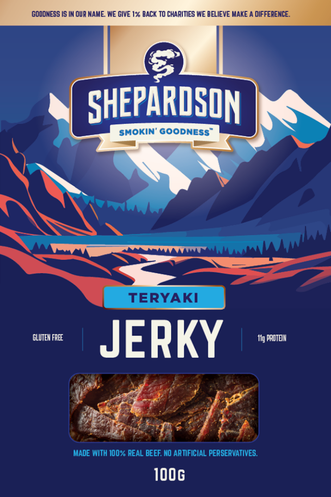
Creating a memorable masthead with an equally identifiable icon creates a eye popping shelf blocker for consumers.
Review, research and get inspired
First, we go exploring. We’ll check out competitors online and in-store to understand the world your product will enter—spotting what’s working, what’s missing, and where there’s room to stand out.
Inspiration can come from anywhere: a clever competitor, a brand in another category, another designer, or even nature.
We’re not copying—we’re collecting sparks. Little ideas and unexpected details that get the creative wheels turning.
Consider this the warm-up: gather the ingredients, stretch the creative muscles, and get ready to play, experiment and see where the ideas take us.
INSIGHTS HELP INFORM DESIGN
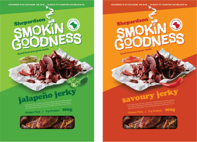
BOLD COLOURS
When you look at the shelf, you’ll notice that many house brands and popular competitive brands tend to play it safe with muted, even flat, colours. One of the simplest ways to break through that sea of sameness is to use bold, unexpected colours that really grab attention.
BOLD FONTS
With fewer SKUs on shelf, we need to make every one count. Our message needs to be bold, simple and instantly clear, helping shoppers quickly see why we’re different. Clear claims and strong messaging are key to standing out against bigger brands with more shelf space.
Imagery
Whether we’re using photography, illustration, or a combination of both, it’s important to think about the quality, impact, and relevance they have for the consumer.
With new products, there’s always a risk that the packaging doesn’t tell the buyer what they need to know. We need to think about how people actually shop. Are they drawn to a cool label? Are they looking at the product photo or how it’s used? Or are they buying because they already know and trust the brand?
The reasons we like a particular package may not be the same reasons a consumer does. They may see it very differently. That’s why it’s important to understand their behavior and what really influences their purchase decision.
SHELF BLOCKING
There are a few ways to shelf block:
1. Keep the overall look consistent Use the logo with a bold, common background across the range, with product name and imagery differentiating each SKU. Think Tostitos.
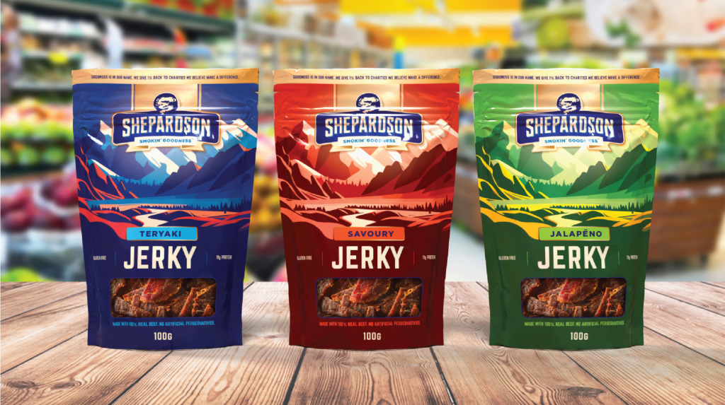
2. Use colour to differentiate Keep the branding and structure consistent at the top, while using different colours and imagery to give each product its own personality. Think Kettle Chips.
3. Keep the header consistent, with more freedom underneath Use a consistent brand header, while letting the lower section tell each product’s unique story. This creates individuality without losing too much shelf-blocking impact. Think Ruffles.
Developing Design Directions.
To get the branding right we need to play in the sandbox. We know what doesn’t feel right initially but it takes time to find a way or ways that feel possible.
Once the design directions become apparent and are different enough to understand, it’s time to get sketching. Play time begins. See examples below.
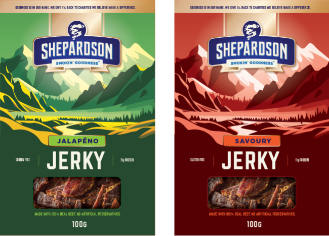
Design Direction 1
Nouveaux Traditional
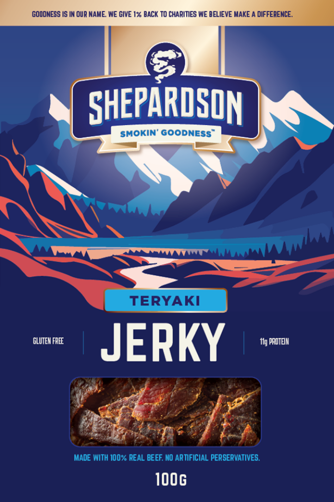
Rooted in rugged outdoors and ranching, this design reimagines traditional jerky branding with a fresh, contemporary perspective. Rugged and refined elements create an authentic brand with broader appeal.
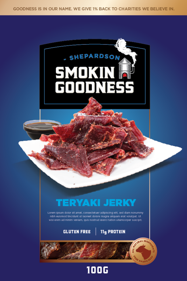
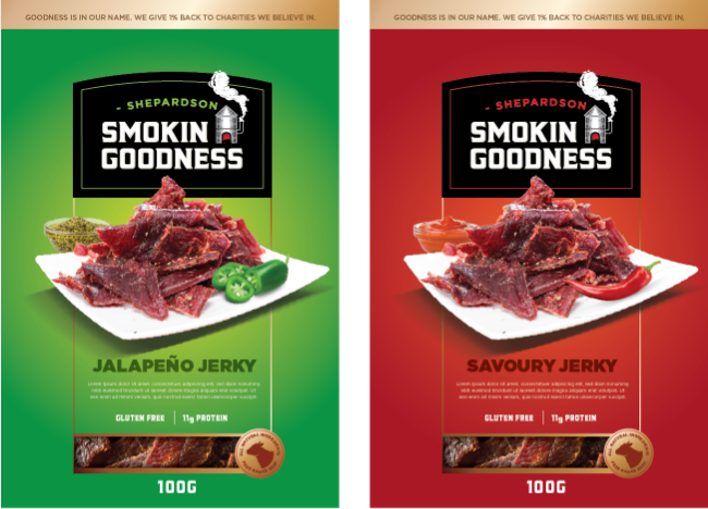
Design Direction 2
Modern Mainstream
Taking the traditional cues of jerky brands and transitioning to a modern food brand that opens the door to a more versatile product offering and the opportunity to sell in a variety of new environments that traditional jerky may not have access to.
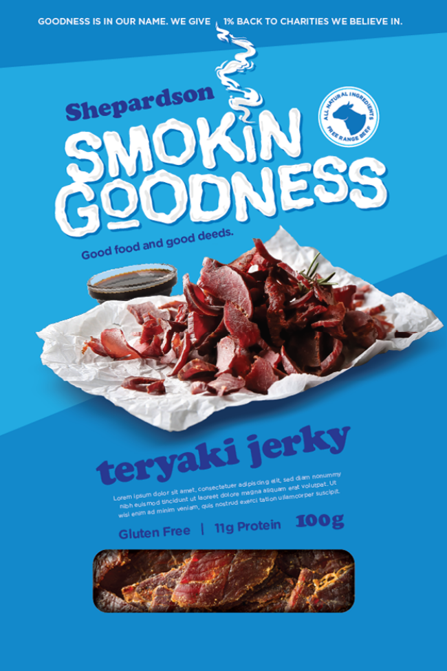
Design Direction 3
Contemporary
Build a food brand bigger than jerky—fun, unexpected, and memorable. Skip rugged clichés for bold flavors, clever names, and a personality people want to engage with. Make it fit anywhere, from lunchboxes to late-night cravings, with jerky as the starting point.
Hero 1
Line Extensions 1
Hero 2
Line Extensions 2
Hero 3
Line Extensions 3
Design Direction 1
Nouveaux Traditional
This design follows the traditional jerky marketing and branding which uses the outdoorsman and rancher iconography. It usually tends to be more masculine but this new twist on traditional makes the brand more appealing to women without alienating men.
Hero 1
Design Direction 2
Modern Mainstream
As the disruptor moniker suggests this design direction is meant to appear as an add on. It should feel like it was added as an after thought to a label or product package.
Hero 2
Design Direction 3
Contemporary
Create a memorable food brand with a fun feel that doesn’t exist just to sell jerky but resonates across demographics and usage without the usual ties to traditional jerky imagery.
Hero 3
Picking a direction, choosing a hero.
Playtime usually is completed when we have three unique directions and fleshed out concepts to share in a presentation to our client. Mockups help define it.
From these designs the client will be ablest to choose a direction to iterate on. Iterating refines the direction until a final “Hero” design is approved.
ONLINE PRESENCE IS KEY - Desktop & Mobile
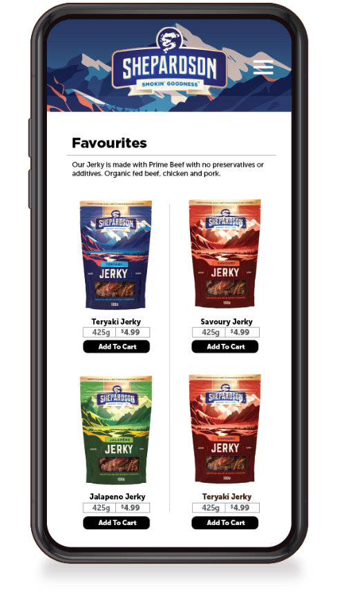
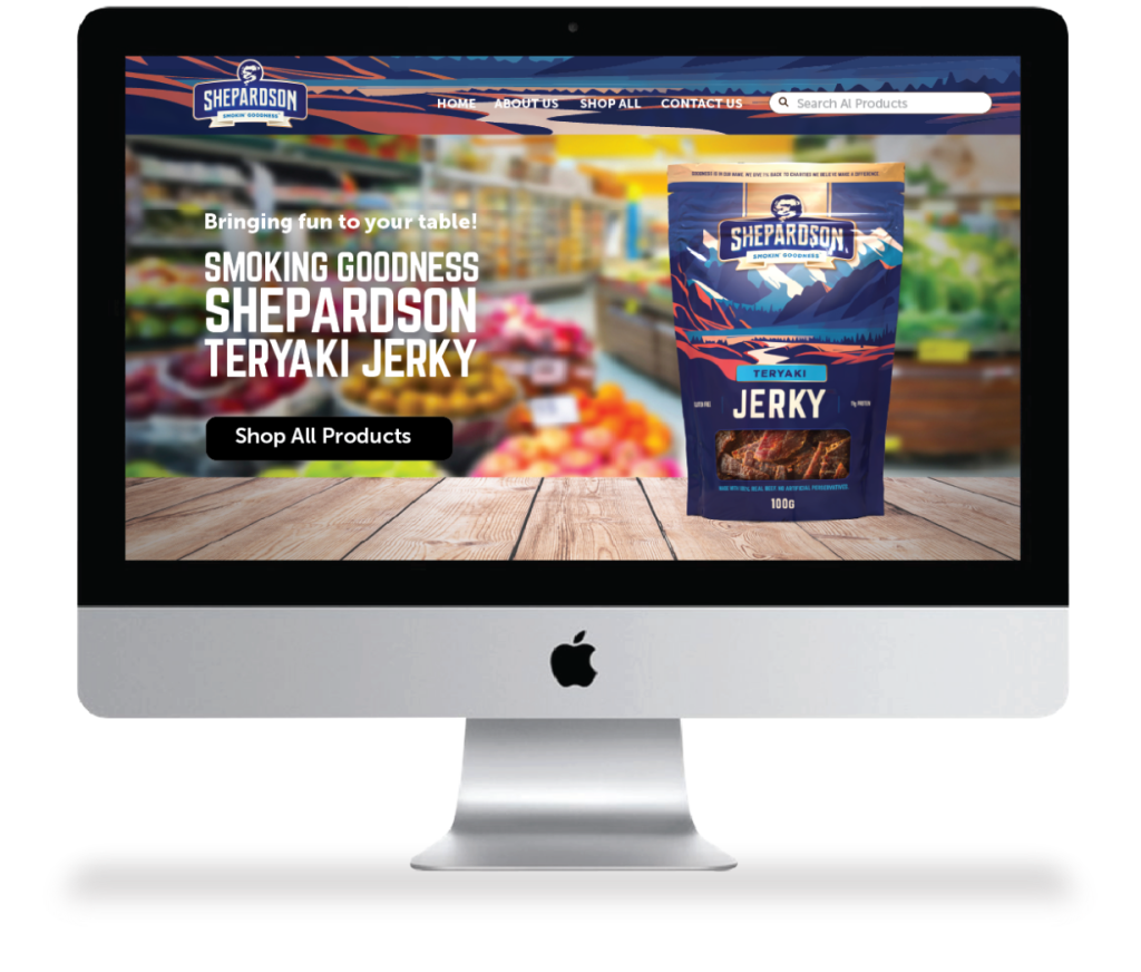
Once the brand direction is approved and a hero pack defined its time to create the online experiences including the website and social media channels.
Continuity across all platforms and experiences means consumers will get a clear idea of what your brand stands for and how it communicates with them.
Website
Shopping cart on both mobile and desktop need to consider the user experience to avoid creating barriers to purchase. Clean, simple user flows are paramount to making a great experience.